I like East State Street. There, you'll find things like El Azteca (best Mexican - period), the Acme Bar (best fried appetizer's) and the Rib Room (mmmm....lots of red meat) along with some really neat houses (in fact there is one that I've ALWAYS wanted to own - ever since I saw it when I was nine years old).
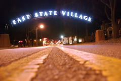
As I was driving through the neighborhood this past weekend, I came across this sign.
I meant to take a photo of this but it was the middle of the day when I was in the area so I wasn't sure how I would maneuver a nice shot in the middle of weekend traffic.
Thank gawd someone else (thanks Fetchy!) had found the right time and right spot :).
Anyway - I mentioned on Sunday, that there were a couple of things that I was confused about. This is at the top of my list.
This East State Village sign.
I don't get it. It's bright and flashy and the font (okay - what's a better word for the lettering style) just seems a mismatch for the neighborhood - at least the neighborhood that I'm used to.
If someone has some insight into this - let me know. I'm definitely interested in knowing the history of it - what led up to it - how the design was chosen - and if the citizens of the area like it. Maybe they do - I'll accept that I'm the sore thumb (sticking out) in this scenario.
3 years ago


2 comments:
It's part of a plan to spruce up State. In addition to the arch there are new brick crosswalks. I live close to that area, and I'm glad that it is getting some attention. My only issue with the arch is that I don't understand why they couldn't make it visible in the daylight. It is really only distinguishable at night when it's lit up. That seems like kind of a waste to me.
I noticed that going up and I almost stopped and took a shot of it that day. I thought it looked good. I haven't seen it at night yet.
Post a Comment